Restructuring navigation to fit business needs
Flo, Winter '23
One of the many major projects I led at Flo was the redesign of the navigation experience of the dashboard. Although seemingly a simple project, from restructuring the information architecture to updating the design language, it was a heavy, but rewarding lift.

Hitting a wall
During the initial ideation phase for Flo, our team rapidly produced iterations. However, we eventually encountered a significant challenge that necessitated a reassessment of our navigation system to better align with the business needs of our target clients. This challenge also provided an opportunity to reevaluate and refine our visual language.

Critical flaws
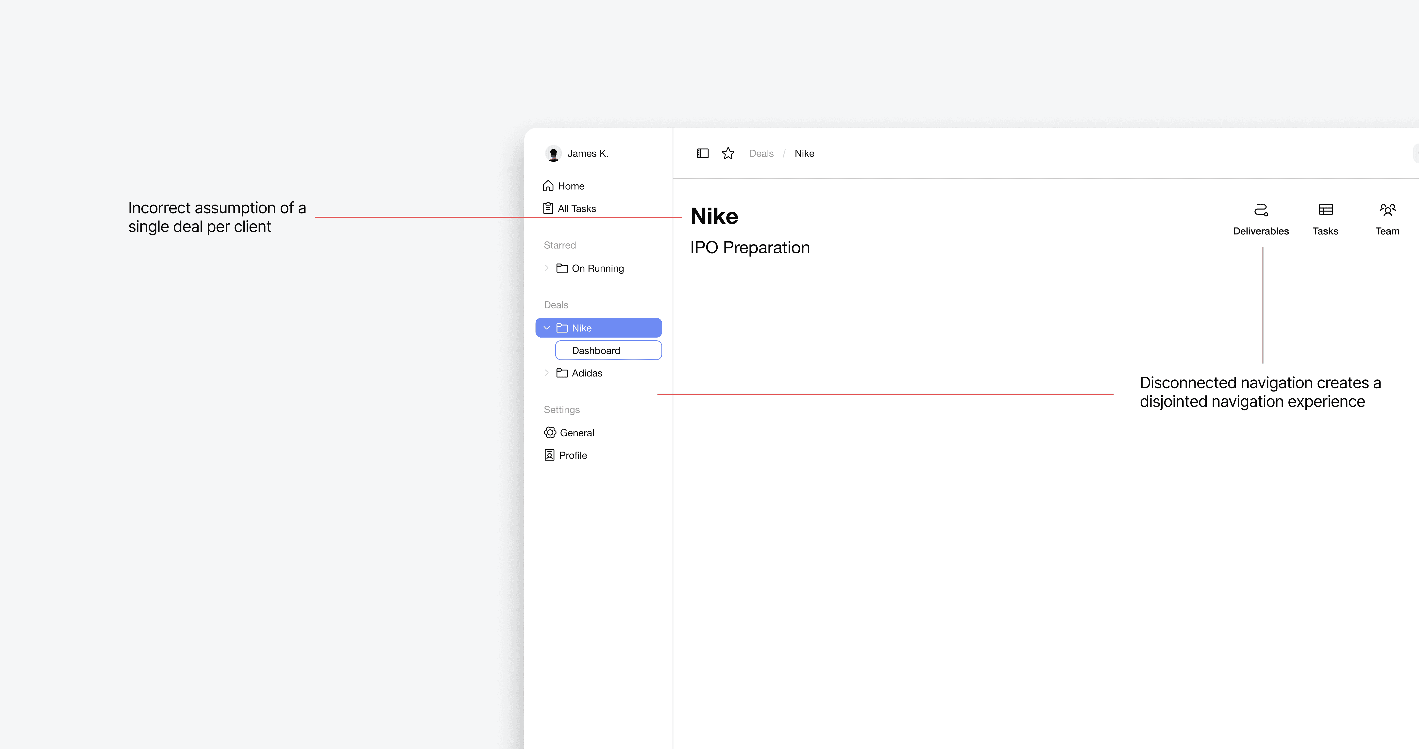
The squint test is our team's method of quickly determining whether the context, state of assigned tasks, and overall progress of a deal are visually clear at a glance. We found that our current navigation system did not meet this criterion.
Furthermore, we discovered a critical flaw in our initial design: the incorrect assumption of a single deal per client. This realization prompted me to reorganize the architecture and navigation method to better accommodate multiple deals per client.
Finding documentation
Before starting the design process, I realized a need to deepen understanding of sidebar navigation—what makes a good sidebar and why it is effective. We explored various documentation sources to find both inspiration and the underlying rationale, aiming to better grasp our problem and ultimately overdeliver in our solution.

Insights we found from Apple's design system documentation
Takeaways
Don't try to fit everything into one sidebar
Sidebars are great for quick glancing
Utilize layers in respect to the information hierarchy
Structuring a new flow
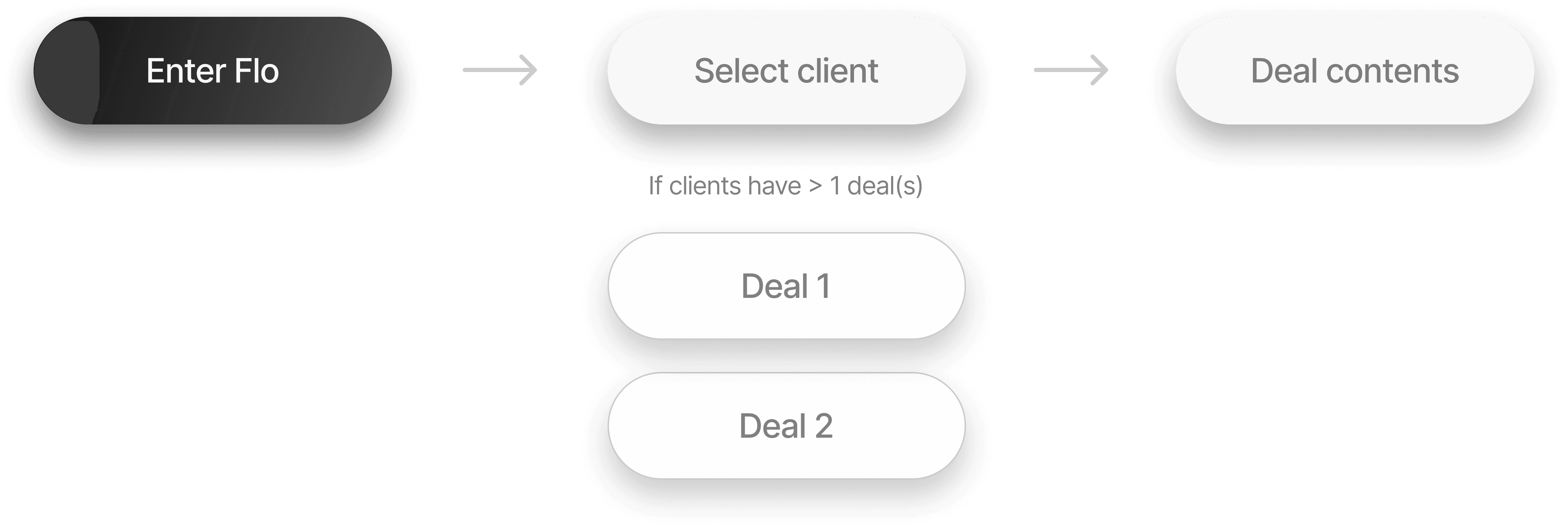
Previously, each client was associated with only one deal.
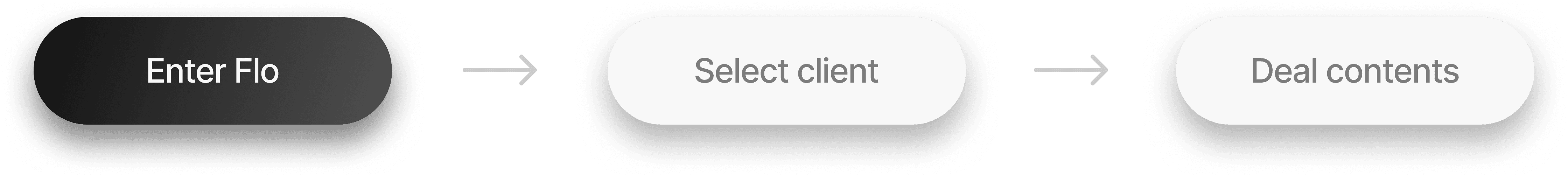
If a client has multiple deals, the user must select which specific deal they want to access. This applies only to users assigned to multiple deals within the same company. Instead of representing each deal individually, we chose to organize them under one parent entity, streamlining the navigation and enhancing user clarity.
Splitting the navigation
Using the team's discoveries, we finalized a system that is more succinct and cohesive, significantly improving upon our previous iterations.
New client navigation

Move between deal with more visual cues and have the ability to select a deal from a client that has multiple.
New deal navigation
Deal navigation is vertical and will be attached directly to the client navigation rather than being on the opposite side of the screen.
Piecing it together
Accepting discomfort
This project was a test of my visual design skills, design thinking, and resourcefulness. From understanding the core issues to taking initiative, my comfort zone was pushed.
The freedom to experiment, while overwhelming at first, became the project's most liberating aspect. It opened the door to innovative solutions, encouraging me to think outside the box and explore design possibilities that I wouldn't have explored in a structured environment.
back